Herrington Carmichael
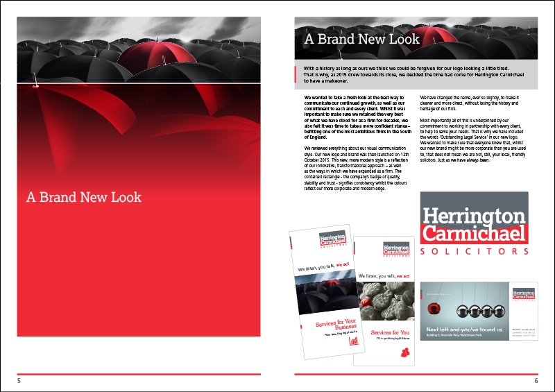
Herrington Carmichael, a long-established firm of solicitors in the Home Counties, asked me to spruce up their corporate branding. And that’s just what I did.

The management team already had a new logo, which had to be reworked and turned into practical, usable piece of artwork for any application. So taking the core of what they had, which were the colours red and black I created a corporate identity which has allowed HC to present a fresh dynamic and contemporary face in their market sector.
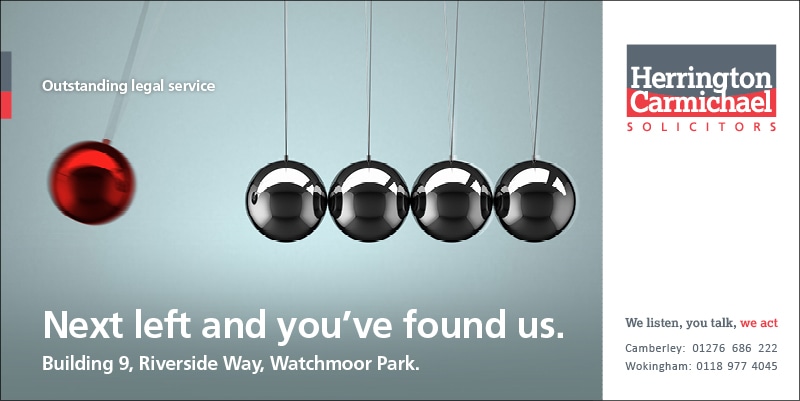
Working with a copywriter colleague we came up with monochromatic images to reflect the seriousness of the business, but each expression contains a feature highlighted in the corporate red. As the campaign builds, the theme will distinguish Herrington Carmichael as different and, better than the rest.
From this overarching concept I developed advertising, posters and digital messages. The simplicity of the idea will allow us to produce an infinite number of variations, keeping the campaign refreshed, ensuring longevity.